

Cities
Delhi NCR & Bangalore
UI/UX
How can a multi-service healthcare app make high-stakes health actions feel simple, credible and easy to complete, especially when users bring expectations informed by mainstream e-commerce platforms?

Qualitative usability sessions explored how digitally fluent consumers moved through the prototype, where friction emerged and what created reassurance across the journey.

Delhi NCR & Bangalore
E-commerce users, fitness buyers, mother and baby shoppers, and consumers managing chronic health needs
App usability diagnostics
Healthcare
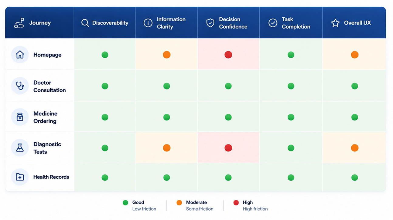
Users quickly understood the app’s primary services, but confidence declined as the homepage became crowded with memberships, promotions, wellness content and repeated modules. A clearer hierarchy was needed to keep core healthcare tasks front and centre.

The strongest experiences maintained one clear objective. Consultation and medicine ordering followed logical, uninterrupted journeys that allowed users to move confidently from discovery to completion.

Search, filters, carts, coupons, tracking and checkout conventions were understood without explanation. These familiar interaction models reduced learning effort, although healthcare required stronger reassurance than ordinary commerce journeys.

Healthcare decisions carried a higher perceived cost of error. Editable bookings, prescription controls, review screens, transparent pricing, doctor credentials, pharmacist callbacks and visible service-provider details helped users verify decisions before committing.

Centralised consultations, prescriptions and reports transformed the app from a transactional platform into a long-term healthcare companion. This value became stronger when visual treatment, service presentation and tone remained consistent with the healthcare provider’s established credibility.
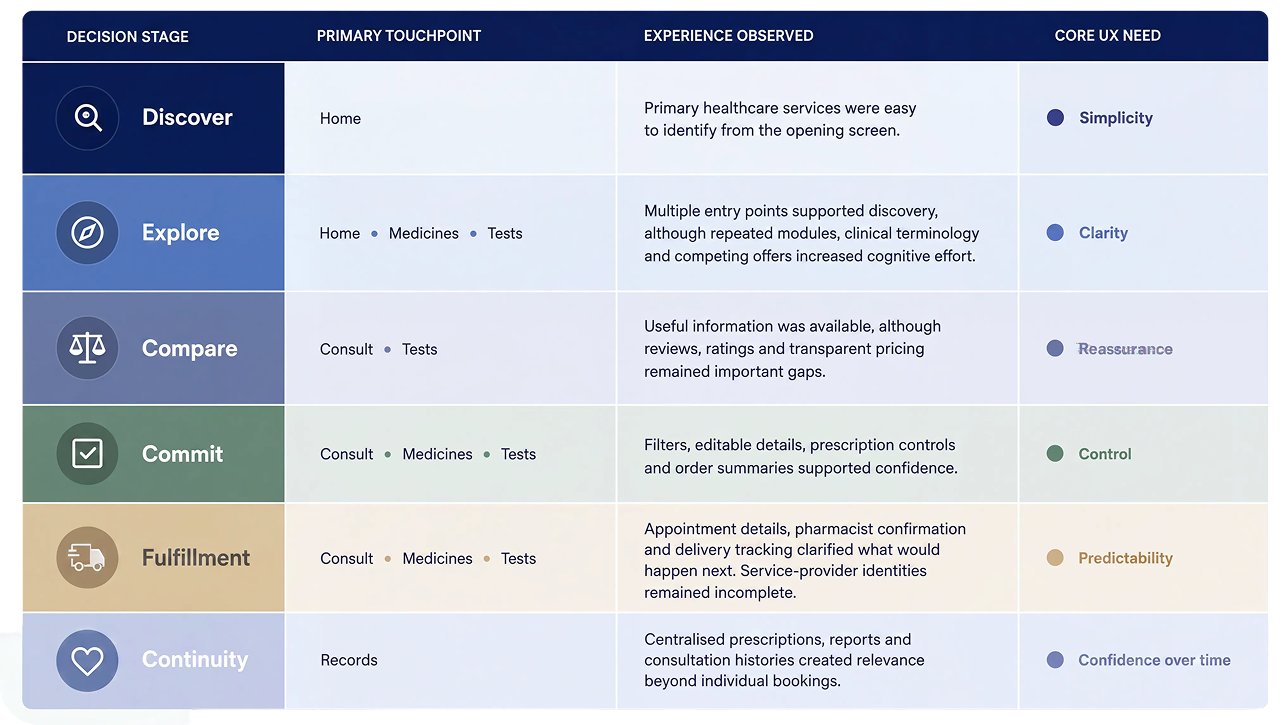
A comparative view of usability performance across the end-to-end healthcare journey.





Place consultation, medicine ordering, diagnostic tests and records at the centre of the experience. Memberships, promotions and editorial content should support these tasks rather than compete with them.
Show reviews, credentials, service-provider identities, fulfilment timelines and support information before users begin questioning whether they can trust the transaction.
Maintain digital convenience while making pharmacist, doctor, delivery and sample-collection support visible when users are likely to need clarification or reassurance.
Present the service, inclusions and final payable price before promotional benefits. Use familiar consumer language and explain why a doctor, medicine, test or product has been recommended.
Apply a unified system of layouts, colours, typography, icons and information hierarchy across the app. Use the healthcare provider’s credibility to communicate quality standards, service ownership and accountability throughout the journey.